More than 500 million Instagram accounts use Stories every day. Translation: There’s a lot of people and businesses competing for attention.
So, if you want to grow your Instagram following, you need to find a way to stand out.
How?
There are countless Instagram Stories design tips, tools, and tactics out there. So much so, it can get pretty overwhelming. Which ones should you use? How should you use them?
If you’re looking for helpful Instagram Story design ideas, we’ve got you covered.
In this article, we’ll take you through 15 Instagram Story design tips that you can start applying today.
Now, let’s cut to the chase.
Post Contents
- 1. Be Consistent to Establish a Powerful Brand
- 2. Use Instagram Story Design Apps
- 3. Use Instagram Story Design Templates
- 4. Use the Right Instagram Story Design Dimensions
- 5. Choose a Great Font
- 6. Create a Brand Color Palette
- 7. Access Every Color
- 8. Use Stunning Images in Your Instagram Story Designs
- 9. Use Backgrounds and Overlays to Highlight Specific Elements
- 10. Create Animated Elements
- 11. Create Edgy and Artistic Graphics in Specialist Apps
- 12. Use GIFs and Stickers in Your Instagram Story Designs
- 13. Prioritize Usability
- 14. Design to Engage Your Audience
- 15. Share Your Message or Tell a Story with Your Instagram Story Designs
- Summary: Instagram Story Design Tips and Tricks
- Want to Learn More?
1. Be Consistent to Establish a Powerful Brand
You can’t create a strong brand without consistency.
If you check out any top brand, you’ll see that they maintain a consistent appearance in all of their content.
For example, notice how Coca Cola's website, Instagram account, and YouTube channel all use our signature red branding:

Maintaining a certain “look” can help you capture people’s attention more often and build credibility.
Still, this doesn’t mean you have to be super-duper polished and perfect all the time.
As billionaire founder of Virgin, Richard Branson said:
“Too many companies want their brands to reflect some idealized, perfected image of themselves. As a consequence, their brands acquire no texture, no character, and no public trust.”
Simply aim for consistency in how you present your brand.
Artisan coffee brand Deathwish Coffee doesn’t have the most polished Instagram Story designs, but they do maintain their brand throughout.
Check out the image below – notice the skulls, the black and red color theme, and the enthusiasm expressed with phrases like, “hell yes,” “just arrived!” and “Death Wish Coffee time!”

Bottom line, consistency is key.
2. Use Instagram Story Design Apps
There are plenty of tools out there that make it easier to design Instagram Stories that capture attention.
Here’s a quick run-down of five great Instagram Story design apps to check out:
- Over: Overlay gorgeous graphics and text to your Instagram Story designs. (Featured in the image below)
- Canva: Access an extensive library of pro graphics and Instagram Story layouts.
- Adobe Spark Post: Edit your photos to perfection and add graphics in the same app.
- StoryLuxe: Find stunning filters and templates to customize.
- Unfold: Add a touch of style and class to your Instagram Story designs.

If you want to find out more, check out our full-length guide on the best Instagram Story apps.
3. Use Instagram Story Design Templates
Why re-invent the wheel?
Countless professional designers have already created an endless supply of eye-catching Instagram Story design templates.
You can find these Instagram Story templates in most design apps. Here are some examples from Canva.

These Instagram templates can help you save time while still maintaining a professional and consistent brand look.
Check out how music video-hosting service Vevo uses Instagram Story layouts to present a profile on a new music artist.

4. Use the Right Instagram Story Design Dimensions
Sometimes it can be awkward to design Instagram Stories on your smartphone – especially if you’re trying to create professional-looking video clips. So, you may want to use your computer.
In which case, you’ll need to make sure that you use the right dimensions.
It’s best to design Instagram Stories that are 1080 pixels wide by 1920 pixels high. These dimensions have an aspect ratio of 9:16.
Here’s an Instagram Story design template that you can use to help. Simply save it to your computer and then import it into your video editor or design program.

It’s worth noting that these dimensions aren’t perfect. This is because the dimensions of Instagram Stories are dependent on the viewing device – and some smartphones have wider or taller screens than others.
To learn more, check out our full guide on Instagram Story sizes and dimensions.
5. Choose a Great Font
As mentioned above, consistency is vital to creating a strong brand look. As a result, it helps to choose a font that represents your brand and then stick to it.
Now, this doesn’t have to be a custom font or the same font that you use on your website. For example, the watch brand Bremont uses different fonts for their website and Instagram Story designs.

However, Bremont does use the typewriter font consistently in all of their Instagram Story designs – and this font fits their classy, timeless brand.

Check out websites like Font Pair, Font Joy, Canva Font Combinations to find a great font for your Instagram Story designs.
What’s more, if you’re into fonts, you could also use an Instagram Story design app like Font Candy on iOS or Font Style Candy on Android to get really creative with your text.

6. Create a Brand Color Palette
In the first section of this article, you saw how Coca Cola creates a cohesive brand look by sticking to our signature blue color palette.
But there’s more.
Different colors elicit different emotions. As a result, they can affect the way we feel about brands, products, and services. They can even affect the decisions we make.
This is why brands are very strategic when choosing a color to use in their marketing communications.
In the graphic below, you can see how colors relate to emotions and how companies use this connection to strengthen their brands.

Interesting, right?
So, if you want to design Instagram Stories that stand out from the crowd, you need to choose a great color palette.
What colors represent your brand best?
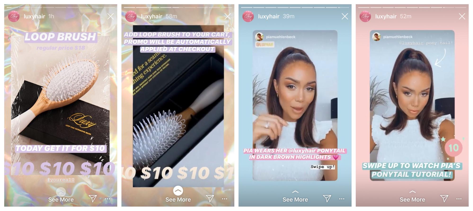
In the example below, you can see how hair extension brand Luxy Hair uses pink, purple, and blue pastel colors to create a soft, feminine look.

To learn more, check out our guide on color psychology.
7. Access Every Color
When you use the drawing or text features in the Instagram app, you can see 27 colors available at the bottom of the screen.
Here’s the cool part: You’re not limited to these 27 colors. Simply hold down any one of these available colors to choose from the whole color spectrum.

Plus, if you can’t get the color you want, you can always use the color picker tool in the bottom-left of the screen. Just tap it and select a color from your image.
8. Use Stunning Images in Your Instagram Story Designs
You don’t need to rely on graphics or roughly-shot video clips for your Instagram Story designs. Mix it up a bit and use some high-quality images.
Apparel brand Herschel makes these Instagram Story designs “pop” with stunning images.

Okay, but how can you use professional images in your Instagram Story designs without hiring an expensive photographer?
Easy: Just use free stock photos.
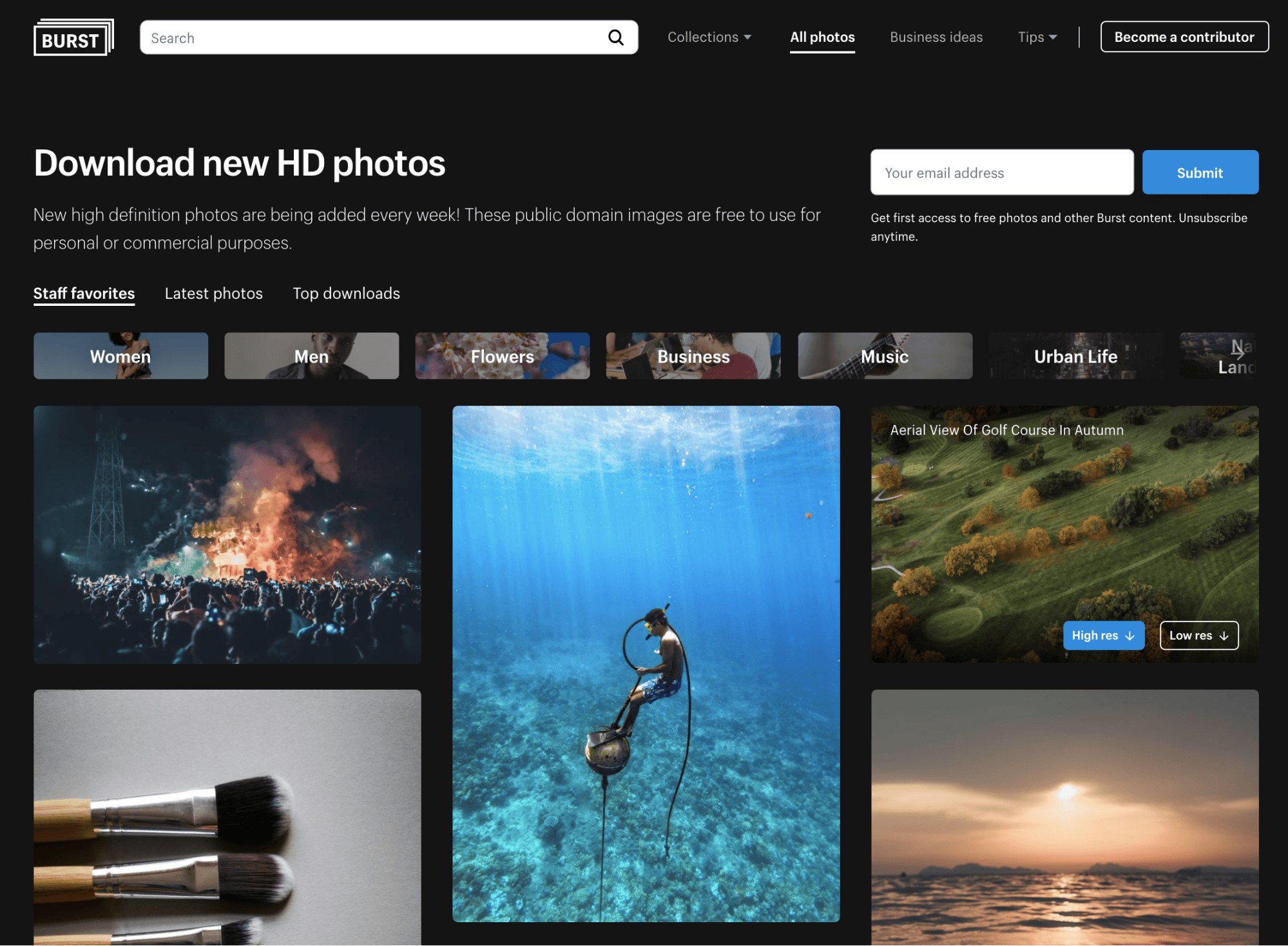
There are plenty of websites that provide free images for commercial use, such as Shopify Burst and Unsplash.

To discover more places to source great photos, check out our guide on 10 of the best stock photography websites.
9. Use Backgrounds and Overlays to Highlight Specific Elements
If you want to highlight something specific, use a colorful background or an overlay.
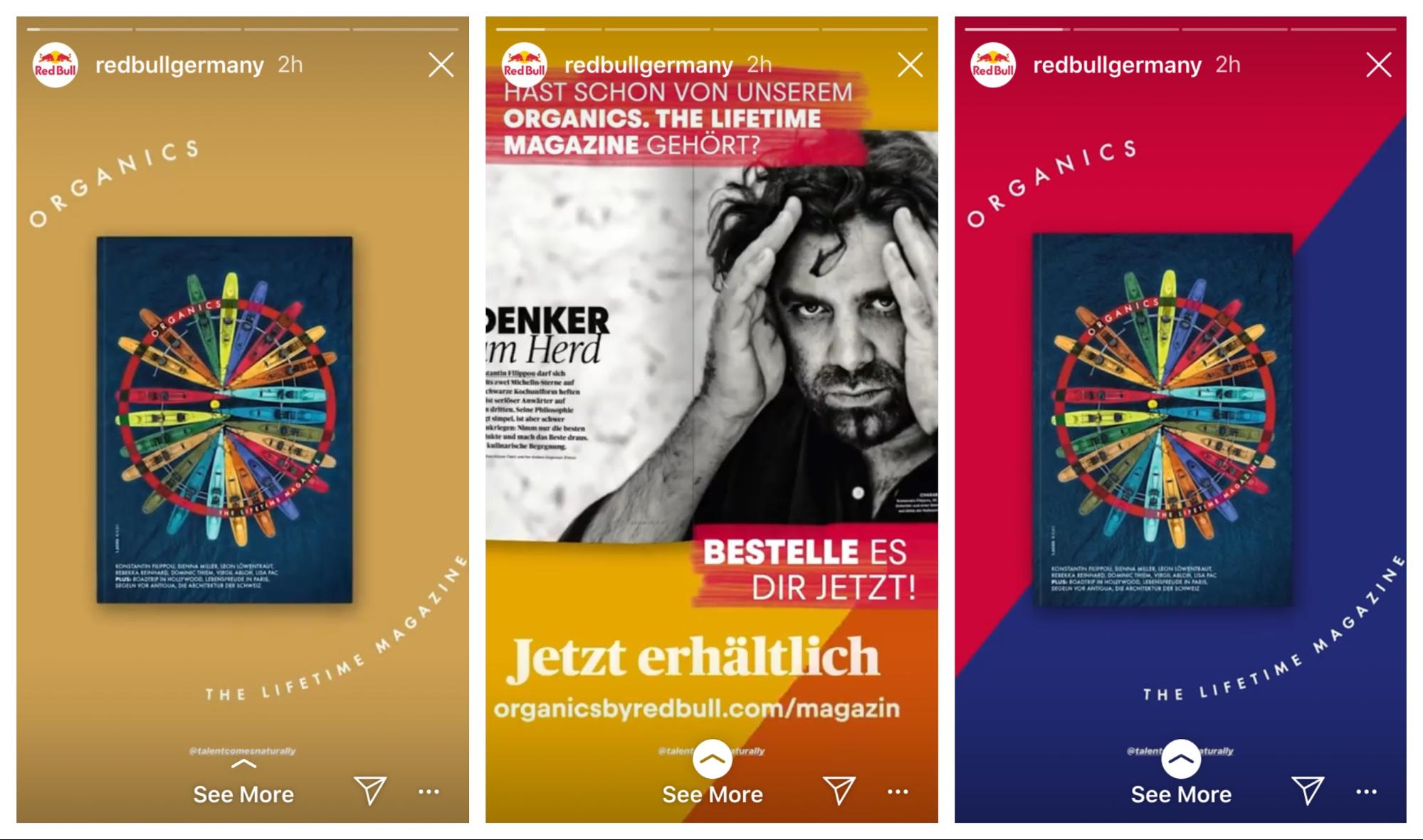
In this example from the energy drink brand Redbull, you can see solid background colors that highlight the design elements featured in the foreground.

There are tons of ways to create backgrounds and overlays.
If you want to design Instagram Stories without using a photo or video, open the draw tool, choose a color, and then tap and hold your thumb down until the entire screen turns that color.
If you like, you could take it one step further and use the eraser to remove part of the overlay to reveal part of a photo.

Be creative and use backgrounds and overlays to bring your Instagram Story designs to life.
10. Create Animated Elements
If you want to design Instagram Stories that are exceptionally eye-catching, try using animations and video elements.
In this example from the watch company MVMT, the brand showcases its Baltic Blue watch over a video of rough seas.

Okay, but what if you’re not an animation whizz and you can’t afford to hire one?
Thankfully, many Instagram apps make it easy to create animated design elements, such as Over, Mojo, Adobe Spark, and Pixaloop.
11. Create Edgy and Artistic Graphics in Specialist Apps
When it comes to designing Instagram Stories, the sky’s the limit. Light leaks, glitter, bokeh, and glitch effects are just some of the creative options available.
Try the VSCO app to apply light effects, and use A Design Ki to draw or write by hand. Also, get creative with your images using apps like Enlight Photofox and Prisma Photo Editor.

12. Use GIFs and Stickers in Your Instagram Story Designs
Instagram has an entire library of stickers and gifs that you can use to spice up your Instagram Story designs.
In this example, the mattress brand Leesa does a great job of using gifs and stickers to add personality to their stories.

Still, proceed with caution.
The occasional gif or sticker can help to liven up your Instagram Story designs. However, if you use too many, your design may look messy or unprofessional.
So how many should you use? The optimum number will be different for every brand. But to start, take a leaf out of Leesa’s book and use one element per slide.
13. Prioritize Usability
A stunning Instagram Story design must still be practical.
As Steve Jobs, the co-founder of tech company Apple said:
“Design is not just what it looks like and feels like. Design is how it works.”
In this example from the makeup brand Sephora, the text is easy to read and the calls-to-action are presented clearly.

The takeaway? Make sure that your Instagram Story designs clearly communicate your messages.
14. Design to Engage Your Audience
It doesn’t matter how pretty your Instagram Story designs are if they don’t engage viewers. In other words, your Instagram Story designs should make viewers feel involved and valued.
ToyShades might not share the most beautiful Instagram Story designs, but they do a brilliant job engaging their followers.
In the example below, you can see two examples of user-generated content and a poll.

So, don’t worry if your Instagram Story designs aren’t exactly works of art. Just make sure that your designs engage your target audience.
Think of design as a way to communicate visually. As the designer, Lorinda Mamo, said, “Every great design begins with an even better story.”
What are you trying to communicate? What story do you want to tell?
All top companies in the world create vision and mission statements to act like compasses that help them move closer to their goals. These statements are born from their hopes, desires, and values.
When you know what you stand for as a company – or as an individual – it’s much easier to create messages that resonate with your target audience.
Take the charity Unicef. In the example below, the charity introduces their new #OneLoveOneHeart campaign, explains what it is, and then compels viewers to get involved.

Like all good stories, it has a beginning, a middle, and an end.
So, before you design Instagram Stories, try to identify what you want to communicate and break it down into a short storyboard.
Summary: Instagram Story Design Tips and Tricks
With so many people sharing Instagram Stories every day, it can be challenging to stand out from the crowd.
To help, here are 15 Instagram Story tips and tricks that you can start using today:
- Develop a consistent brand-look.
- Use Instagram Story design apps like Over, Canva, Adobe Spark Post, StoryLuxe, and Unfold.
- Use Instagram Story design templates to create professional content quickly.
- When you design Instagram Stories on your computer, use the dimensions 1080px by 1920px – or an aspect ratio of 9:16.
- Choose a great font using services like Font Pair, Font Joy, and Canva Font Combinations.
- Choose a color palette that represents your brand, and use it consistently.
- When choosing colors in Instagram, hold your finger down on the color to access more colors, or use the color-picker tool.
- Source stunning images that are free for commercial use from Shopify Burst and Unsplash.
- Use backgrounds and overlays to draw attention to specific design elements.
- Create animated elements using apps like Mojo, Adobe Spark, and Pixaloop.
- Get creative and create edgy, artistic graphics with apps like VSCO, Enlight Photofox, and Prisma Photo Editor.
- Use the occasional gif or sticker to spice up your designs.
- Prioritize usability and make sure that the text is always easy to read and that calls-to-action stand out.
- Design to engage your Instagram audience and take advantage of user-generated content and polls.
- Focus on sharing a message or telling a story with your designs.
Have we missed any great Instagram Story design tips or tricks? Let us know your thoughts in the comments below!
