The secret to success boils down to experimentation. And to succeed through experimentation, you need to try everything at least once.
I created my first Facebook Ad in 2014, which was an engagement ad, to get a feel for how the platform works. That first ad didn’t get actually get any engagement, and that failure motivated me more than ever.
I vividly remember going through every single resource I could find on Facebook ads for beginners to learn every single trick I could find online and compile them all together to create a winning ad.
And I did create a winning ad. The second ad I ever created brought more engagement than I could’ve ever imagined.
That small success proved the power behind Facebook’s advertising platform.
Since then, I’ve created countless ads in various niches such as automotive, suncare, yoga, pets, home decor, and much more. I can’t share them all, but I will share a few of my biggest advertising mistakes.
Post Contents
-
10 Advertising Mistakes I Made That You Should Avoid
- 1. Starting With an Engagement Ad
- 2. Not a Broad Audience
- 3. Sending Traffic to the Homepage
- 4. Failing to Monitor My Margins
- 5. Using a Boring Photo
- 6. Not Testing Checkout Before Adding Your Pixel
- 7. Boosting Posts on Pinterest
- 8. Not Bringing in Relevant Traffic
- 9. Not Considering Other Cultures
- 10. Failing to Try Retargeting Ads Sooner
- Conclusion
10 Advertising Mistakes I Made That You Should Avoid
1. Starting With an Engagement Ad
One of the biggest advertising mistakes I’ve ever made was starting with an engagement ad.
And I don’t mean that in the sense of creating one.
If the goal of your ad is to get as many eyeballs on it as possible, then by all means create an engagement ad to increase your brand awareness.
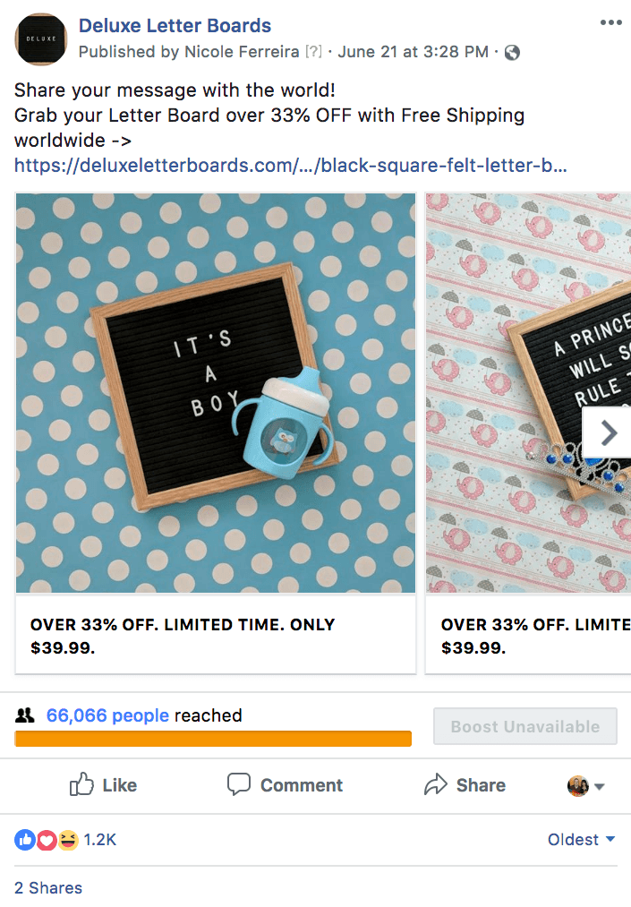
But when I was working on my Deluxe Letter Board store, I wanted to make my ad look more popular, so I created an engagement ad first.
The ad ended up getting 1.2k likes at two cents a click. However, when I used that same post and tried to create a conversion ad, it didn’t generate any sales as that post had been optimized for engagement first.
And to be honest, I hadn’t given the Facebook pixel enough data to let it know what type of person would buy a letter board.
Ultimately, the ad using this formula didn’t end up generating any sales, even though people liked the content.
2. Not a Broad Audience
At a Facebook event I attended recently, a Facebook employee told me that it’s better to go broad with keywords rather than specific.
I wish I knew that a few years ago while working on promoting my personal website a few years ago.
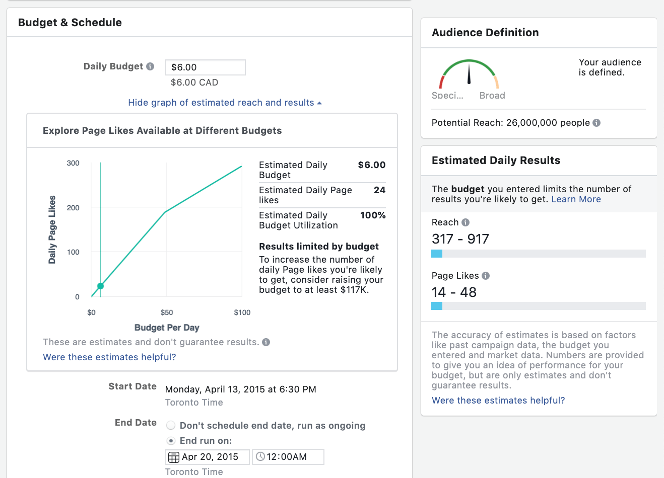
Back in 2015, I thought that the secret to creating a great Facebook ad was to hit the exact center of the “Audience Definition” metre. Every time I created an ad I would always focus on trying to get the “Your audience is defined” text on my ad.
However, the reality is my best performing ads always have a broader audience. You’ll still want to stay within the green zone but you’ll want the metre to lean a little bit more to the right to help you find ad success.
3. Sending Traffic to the Homepage
If you only sell one product, or if your homepage is a landing page, you’ll want to skip this advice.
However, if you’re selling several products on your online store, you’ll get more bang for your buck by promoting a product page instead of a home page.
The reason for this? Well, on Shopify, the add to cart button is always above the fold. However, on the homepage, even if you’ve added an add to cart button for your best-seller, potential customers will have to scroll to find and buy the product.
It’s best to make the transition from somebody clicking on your ad to adding to their cart as seamless as possible to increase conversions.
The longer it takes for a customer to find the add to cart button the less likely it is for them to make a purchase on your store.
4. Failing to Monitor My Margins
When I published my I Spent $191,480.74 on Facebook Ads. Here’s What I Learned. article a few people noticed that my margins were thin. I still made money because my product cost was low. However, I didn’t make as much as I could have on my store.
The biggest challenge when it comes to margins that people don’t take into account is how many failed ads you’ll have before you create one that succeeds. And that does eat away at your margins. A lot of new store owners will spend $1000 on ads and not generate a single sale.
When I was selling print on demand products, our product costs were four times more expensive so every sale we did get didn’t even fully cover the cost of our ads.
It’s really important to take ad costs into account when pricing your products. So many new entrepreneurs want to compete with Amazon pricing but it’s just not profitable to do that.
What you don’t see behind Amazon is their powerful affiliate marketing program which helps them reduce their ad costs. With affiliates sending Amazon traffic and generating sales, they only pay a commission for products sold. So it is easier for them to sell products at lower prices.
When pricing products, stay within market value. If you find competitors in your space charge $40 for a women’s blouse, you can also charge $40 for a women’s blouse. Don’t price compete, it’s the easiest way to lose a ton of money.
5. Using a Boring Photo
Whenever I start a new store, I always want to get that first sale quick. Unfortunately, when your online store is only a few days old, you might not have the type of photos that result in an impulse buy. Some people don’t have influencer photos on their products so instead they use a product photo with a plain white background. If you’ve ever done this, I feel you. And I wouldn’t be surprised if you were as disappointed as I was when I tried this.
When you finally find the ideal photo for an ad on Facebook, you’ll have an aha moment that makes you immediately realize what you’ve been doing wrong all along.
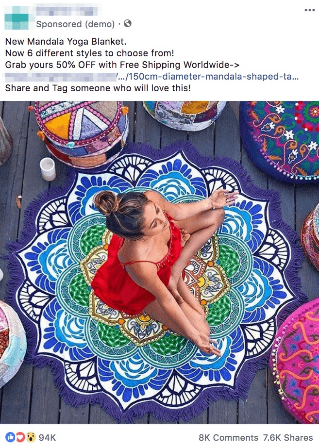
The best converting photos on Facebook ads, based on my personal experience, tend to include a picture of an influencer. You can reach out to influencers on Instagram via a Direct Message if there are any in your niche you’re interested in partnering with.
The picture needs to showcase the benefits of the product or show how the product can be used to help illustrate why someone would need to buy it.
You also want to include a photo that’s different from other products out there, maybe you capture the photo from a different angle. Or the product is in a different color scheme than anything else on the market which helps make it more enticing. The color red in particular tends to make a photo pop, even if there’s just a glimmer of it in the photo.
6. Not Testing Checkout Before Adding Your Pixel
One of the big mistakes I sometimes forget to do when working on a new online store is test out the checkout process. You’d be surprised at what you might find when completing the checkout process yourself. For example, if you also sell print on demand products, you want to check to see what the shipping prices are that customers will see. Doing this in advance will save you from having a ton of abandoned carts.
I recommend ordering a test sample before adding the pixel on your website so that Facebook doesn’t grab data about you and base the audience around who you are since odds are you’re not the ideal customer for your ads. After you’ve placed the test order and before you create an ad, add the Facebook Pixel or the pixel of the advertising platform you’re using to your website. This pixel will help platforms like Facebook understand what type of people visit your website, add to cart, and buy. Thus, helping to make your ads more effective at converting.
7. Boosting Posts on Pinterest
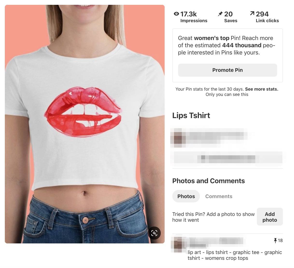
The first time I created an ad on Pinterest, I made the biggest rookie mistake – I boosted a post instead of creating an ad. The promote feature was visible on the pin and for some reason I thought that was how Pinterest’s advertising platform worked (super embarrassing, I know).
So instead of creating an ad, I boosted the post. I did get some clicks to the website. However, I forgot to add the Pinterest pixel to my website before creating the ad so the numbers of the ad didn’t match up.
The biggest reason why boosting the post was my biggest mistake was that I was using my personal Pinterest account for the post. So the only people who saw the ad were my friends and family in Canada. I kept seeing that I was getting Canadian traffic and I couldn’t figure out why no one in the United States was seeing my ad. But when I finally realized my blunder the ad budget was already spent. This ad didn’t land a single sale.
The reality is Pinterest does have an advertising platform where you can segment your audience to find your ideal customer. You still want to focus on conversion campaigns, so if you’re about to start an ad and it says traffic campaign at the top you’re in the wrong spot. And you maybe want to try avoiding using your personal Pinterest account for ads, even if it has more followers.
8. Not Bringing in Relevant Traffic
The most important part, that almost everyone neglects, of creating a Facebook ad is to get the right traffic to your website.
I got my first sale in only two days on one of my online stores by creating yoga quote articles. These articles would be centered around an influencer. For example, “10 Inspiring [Yoga Influencer] Quotes You Need to Read.” Then, I’d add a Facebook pixel to my website and create my retargeting ad.
Immediately afterwards, I’d go on Twitter and Facebook and tell the influencer that I featured them in my article. And while not all shared, enough sent a sizeable amount of relevant traffic which helped me generate my first few sales. Those sales then helped make my ads more effective. A virtuous circle!
9. Not Considering Other Cultures
The world is filled with billions of people who share unique beliefs, values, personality traits, and quirks that set them apart from one another. As an advertiser, you need to be mindful of that when creating your ads.
When promoting clothing, you might need to be mindful of how much skin is showing in countries where clothing is more conservative.
A friend once created an ad with a photo of a ‘punk rock grandma’ which greatly offended countless people in a European country.
So, when creating an ad, be sure to segment your audience so that you consider the culture and values of that country you’re targeting. Not all product photos will work well internationally. Taking the time to understand cultural differences can help you create more personalized international ads.
10. Failing to Try Retargeting Ads Sooner
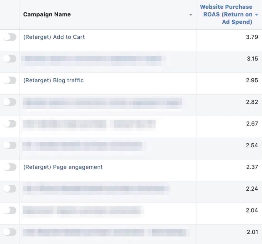
I built several online stores before creating my first retargeting ad. And I wish I tried it sooner. My retargeting ads usually had a better return on investment. These are the top returns on my top ten ads. The retargeting ads we created consistently creeped up on this list.
The magic of a retargeting ad is that it’s a way to win back first time visitors. Not everyone is ready to buy their first time.
I’ve spent so much money on cold traffic, never thinking of what would happen if I had spent more time trying to bring back those people to reconsider my store and make a purchase.
Had I tried a retargeting ad sooner, I would’ve saved myself a ton of advertising money long-term.
Retargeting add to carts is a more efficient way to win back abandoned carts rather than sending an email out and it proved to be our best-performing retargeting ad.
Retargeting our blog traffic, using the yoga quotes articles that I mentioned earlier, also helped elevate our sales.
Conclusion
To achieve success in advertising, you’re bound to experience failures and setbacks. With every failed ad, you’ll learn some hard lessons that’ll bring you closer to an advertising win.
Don’t be discouraged when your first few ads failed, think of them as an advertising education you’re paying for. You can learn a lot from your mistakes. Even the best marketers will create bad ads. The only difference is that they take time to reflect on what went wrong before going back to create their next ad. So keep creating and experimenting and you’ll be well on your way to success with one of your future campaigns.

